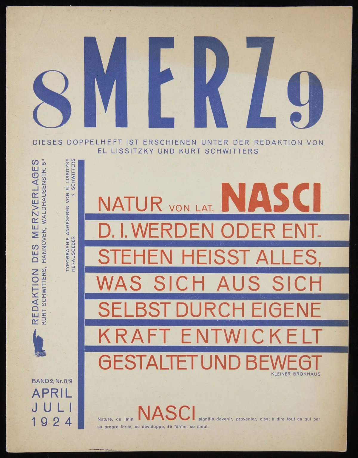
A magazine type layout is the fixed structure of columns, type sizes, and spacing rules that a publication builds every page on. It is made before any story is written, tested against dummy content, and then adjusted story by story. The grid is the skeleton; the decisions around it are what make one spread feel calm and another feel urgent.
The work looks invisible because it is. Readers rarely notice a layout unless it fails. What follows is how the structure gets built, who bends it, and why a memorable spread usually comes from a designer pushing a system that already exists rather than inventing a new one.
What is a magazine type layout, and why does every publication need one?
A magazine type layout is the template that governs where text, images, headlines, and captions sit on a page. A magazine, in the general sense, is a periodical publication issued on a regular schedule and containing a mix of articles, photographs, and other content for a particular audience, as Wikipedia defines it. That regularity is the whole reason a fixed layout exists: the same title must read as the same publication, issue after issue, whether the feature is a photo essay or a business report.
The layout does three jobs at once. It sets a rhythm readers learn within a few pages. It separates editorial voice from advertising at a glance. And it constrains the designers, which sounds negative but is the point. A system that allows anything produces pages that look like anything, and a magazine that looks like anything has no identity. For related coverage, see What a Lining Actually Does: Four Engineering Jobs Hidden Inside a Garment.
How does the grid work before any story arrives?
Every layout starts with the grid: an invisible set of vertical columns and horizontal baselines drawn inside the page margins. A typical grid might divide the page into three, six, or twelve columns. Text sits across one or two of them. Photographs span two or more. Headlines can break the column edges, but only deliberately.
Baselines matter as much as columns. Body text is set so that every line lands on the same horizontal rhythm, page after page. When a designer breaks that rhythm, the reader feels it even without knowing why. The grid also carries practical freight: it fixes where page numbers and running heads go, and it keeps captions and pull quotes from colliding across a spread.
The grid is decided once, for the whole publication, usually in a redesign. It is drawn at actual size, tested with dummy text and placeholder images, and revised until ordinary content fits without strain. Only then do real stories enter the system.
What decisions turn a grid into a spread?
The grid is fixed; the spread is a negotiation. When a story is laid out, the designer and the art director make a short list of decisions:
- Opening. Where the story starts, how large the headline is, and whether the first image bleeds off the page edge.
- Type hierarchy. Which sizes and weights mark headline, standfirst, body text, captions, and folios. Body size almost never changes; everything above it signals importance.
- Pacing. How much white space the story gets, and whether the reader's eye rests between sections or is pushed straight through.
- Image treatment. Full page, half page, or a small inset, and whether images share a spread with text or get room of their own.
Most of these are choices among pre-approved options. The type sizes were set in the redesign. The caption style was settled years ago. What varies is the combination, and that is where a spread earns its character.
Why do memorable spreads bend the rules instead of breaking them?
A spread people remember usually breaks exactly one rule and keeps the rest. A headline set sideways across a gutter works because the body text below it sits obediently on the grid. A single photograph filling both pages works because the following spread returns to normal pacing. The deviation reads as intention only against a background of consistency.
Consider how a long-form feature is treated by a publication with a strong visual identity. A story such as the jellyfish feature promoted on the National Geographic Magazine cover, on the sudden abundance of jellyfish worldwide, is the kind of assignment that earns its own visual treatment: the photography carries the opening, the type steps back, and the layout gives the subject room a news section never would. The grid underneath is still the same grid the rest of the issue uses.
There is a useful parallel in garment construction, where a system of control marks keeps production honest and deviations readable. Our explainer on notches and control marks makes the same point in cloth: standards are what make a deliberate exception legible. A layout works the same way. This connects to our earlier piece, Notches and Control Marks: The Small Cuts That Keep Sewing Factories Honest.
What does the layout process cost, and who owns it?
The layout is owned jointly. The art director owns the system and approves every break from it. The designer owns the page: placing images, fitting type, and solving the small collisions the grid cannot anticipate. The photo editor negotiates how images are cropped and sequenced. The copy editor owns the last pass, checking that nothing was cut or added after the type was fitted, which is the most common source of late errors.
The cost shows up in rounds, not rates. A feature spread typically goes through several passes: a rough thumbnail to agree on structure, a first layout with real images, a revised layout after the text is edited to length, and a final proof. Each round exists because text and design change each other. A story cut by two hundred words changes the image sizes; a photograph cropped tighter changes where the eye enters the page. The layout is finished when those adjustments stop producing changes, not when time runs out.
What this means for anyone studying a magazine spread
Our analysis: the fastest way to read a layout is to look for the system first and the exception second. Find the column edges the body text obeys. Find the type size that repeats on every page. Then ask what the designer did differently on this spread, and why. The answer is almost always one deliberate break, chosen because the story needed it.
That discipline is transferable to any design field that ships on a schedule. The same logic that keeps a size 12 pattern from being a scaled-up size 6, as our piece on grading rules explains, keeps a magazine from drifting issue by issue. Systems carry quality; judgment spends it.
What remains unknown to the outside reader is the negotiation itself: which breaks the art director rejected, which crops were argued over. The printed spread is the record of decisions, not the decisions. That is why the same grid, in different hands, produces such different magazines.