A designer monogram does one job: it compresses an entire brand into two letters or a single mark small enough to sit on a button. Wikipedia's entry on the term defines a designer as someone who plans the form or structure of something before it is made, and a monogram is exactly that kind of planning, applied to identity rather than to a garment. The most important qualification is that a monogram is a system, not a picture. It has to work at the size of a zipper pull and across a full printed canvas, which is why the famous ones look the way they do.
That system logic explains the recurring moves across fashion houses: letters that interlock instead of sit side by side, marks that repeat in a grid across fabric, and symbols that replace words entirely. Each choice solves a practical problem. This article reads those choices the way a pattern cutter reads a seam, as decisions with reasons behind them.
Why do so many monograms interlock the letters?
Interlocking solves a space problem. Two letters placed side by side need width, and width is scarce on a clasp, a heel, or a small leather tag. Overlapping the letters lets both stay legible while the whole mark shrinks. The overlap also creates a second benefit: the joined shape becomes a single silhouette that the eye learns to recognize as one object, not as two letters read in sequence.
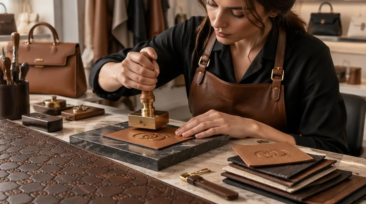
There is a production reason as well. A mark that will be embossed, engraved, or woven has to survive the process. Thin gaps between separate letters close up when a die presses into leather or when a Jacquard loom renders a motif in yarn. Interlocked letterforms let the strokes share structure, so the mark stays intact at the coarse resolutions that physical manufacturing imposes.
What makes a repeating monogram pattern work on fabric?
A repeated monogram is a wallpaper problem. The motif must tile, meaning it has to sit at regular intervals with enough spacing that no two marks crowd each other, and it must look intentional from across a room. Houses that print or weave their marks across canvas treat the monogram as a textile design first, which puts it in the same family as any repeating print: the spacing, the scale relative to the body, and the rotation of the motif all decide whether the fabric reads as a pattern or as noise.
Scale does the heavy lifting. A small, dense repeat reads quiet and works on tailored pieces. A large, sparse repeat reads loud and tends to appear on bags and outerwear, where the flat panels give the motif room. The same two letters can therefore produce two completely different garments depending only on how the repeat is set. That flexibility is the point: one mark, many registers.
Why do some houses drop the letters entirely?
Because a symbol travels better than a word. A letterform depends on the alphabet the viewer reads, but an abstract mark, a flower shape, a geometric sign, crosses language borders without translation. It also survives reduction better: a single bold shape stays recognizable on a 5-millimeter stud, while a detailed crest turns to mud. The trade-off is legal and practical rather than purely aesthetic. A house that abandons its letters needs the symbol to be distinctive enough that the shape alone identifies the maker, which is why these marks tend to be simple, closed, and geometric.
Our analysis of the three main monogram types, interlocked letters, repeating patterns, and standalone symbols, is that they form one continuum of compression. Each step removes information and adds recognition. The letters carry the name; the pattern carries the name across a whole surface; the symbol carries the name in the smallest possible footprint.
How does a monogram survive counterfeiting and time?
A monogram is the most copied object in fashion, so part of its design logic is defensive. Houses respond in two ways. One is precision: exact proportions, specific typeface cuts, and consistent placement that a careful eye can check. The other is technology, and here the work has moved off the surface. Item-level tagging now lets a garment carry its own identity in a chip rather than in a print, a shift covered in the network's piece on how item-level RFID tagging is rebuilding inventory accuracy in apparel. The visible mark signals; the hidden tag verifies. This connects to our earlier piece, How Item-Level RFID Tagging Is Rebuilding Inventory Accuracy in Apparel.
Longevity is the second test. A monogram that leans on a current typeface trend dates itself, and the garment with it. The durable ones are built from letterforms with plain geometry, thick-and-thin contrast kept modest, and no ornament that a decade can make look stale. This is the same reasoning that governs good magazine letterforms, where the craft of choosing and setting type decides how a page ages, as explained in how magazine type layouts are actually made, from grid to printed spread. For related coverage, see How Magazine Type Layouts Are Actually Made, From Grid to Printed Spread.
What should a reader look for in a monogram?
Look at three things, in this order. First, construction: whether the mark is crisp at its smallest appearance, because sloppy reduction is where cheap copies show first. Second, consistency: whether the same mark appears in the same proportions wherever the house uses it, from hardware to lining to woven label. Third, restraint: whether the mark earns its place on the garment or is doing the work the cut and fabric should be doing. A well-designed monogram supports a garment; a loud one sometimes substitutes for one.
That final check is a design judgment, not a status judgment. The monogram is a piece of graphic engineering that has to coexist with pattern cutting, fabric, and proportion. Readers who want the wider context of how garments are actually engineered can start with the publication's design coverage, which treats construction decisions, from closures to seam types, as the real substance of a piece.
What a monogram ultimately is
A famous fashion monogram is a brand reduced to its minimum survivable form: letterforms chosen to interlock, repeat, or stand alone because those structures survive manufacturing, scale, and copying. The evidence for the design logic sits in the marks themselves, in how they behave when shrunk, tiled, and worn. What remains unknown is how the next generation of houses will balance the visible mark against invisible verification, as tagging technology moves identity below the surface. The letters on the clasp will keep doing their job either way, quietly, at 5 millimeters.